

Introduction
Vue.js, a progressive JavaScript framework, provides a significant feature known as directives that improves the way you modify the DOM and develop interactive user interfaces. Directives are special attributes with v- prefix that allows you to add reactive behaviour to components in your templates. They are one of the primary features that distinguish Vue.js, allowing developers to enhance HTML with unique functionality and encapsulate complicated behaviour into reusable components.
Prerequisites
Before getting started, ensure you have the following prerequisites:
Basic understanding of Vue.js, including components and reactivity concepts.
You have a Vue.js project set up, Node.js, and npm installed.
Familiarity with HTML, CSS, and JavaScript is helpful.
Have install a code editor like Visual Studio Code.
These prerequisites will prepare you for exploring custom Vue.js directives effectively.
When and Why to Use Custom Directives
Looking at when and why we use custom directives, directives come in built-in forms like v-model, v-bind, and v-if, which provides essential functionalities for data binding, dynamic rendering, and more. However, there are scenarios where the built-in directives might not cover the specific behaviours you need. This is where custom directives come into play. Custom directives allow you to create your own directives tailored to your application's unique requirements.
Overview of Use Cases
Custom directives have a wide range of applications that can significantly simplify your codebase and improve code readability. In this article, we'll explore various use cases to showcase the practicality of custom directives. From detecting clicks outside specific elements to adding debouncing behaviour, controlling scrolling interactions, and establishing model-based two-way binding, we'll cover scenarios that demonstrate the flexibility and power of custom directives.
Let's dive into some concrete use cases that illustrate how custom directives can solve common challenges in Vue.js applications:
Uses Cases
Let's dive into some concrete use cases that illustrate how custom directives can solve common challenges in Vue.js applications:
1. Click Outside Directive
The "Click Outside" directive is a useful tool for dealing with a typical user interaction issue. You'll frequently come into instances in which you wish to dismiss a dropdown, modal, or other UI component when the user clicks outside of it. While Vue has methods for dealing with this, implementing a reusable directive makes the process more straightforward and uniform throughout your application.
2. Debounce Directive
Debouncing is a method that is used to postpone the execution of a function until a particular period of time has passed since the last invocation. It's especially beneficial when you wish to regulate the frequency of function calls, such as search recommendations or data auto-saving. You may improve the user experience and performance by creating a custom Debounce directive.
3. Scroll directive
When a user scrolls to a certain location on a web page, you can specify the actions you want to do in response using the "Scroll" directive. This may be very helpful when implementing functions like content loading slowly or revealing items as the user scrolls down the page.
4. Model-based Directive (Two-way Binding)
The Model-based directive facilitates two-way data binding between a data model and a DOM element. While Vue.js offers built-in two-way binding with input elements using v-model, there are instances when you need to apply two-way binding to non-input components or custom elements. This is where a "Model-based" directive comes in handy, allowing you to create your own two-way binding behaviour tailored to your components' needs.
Setup
We now understand the groundwork for realizing the possibilities of Vue.js custom directives and some of their applications. We will now look at the practical elements of creating and implementing directives.
Registering a Simple Global Directive
Registering a global directive in Vue.js allows you to use it across your entire application without the need for explicit import statements in each component. This is particularly useful when you have a directive that you want to apply universally.
Assume you want to develop a directive named v-highlight that changes the background color of an element when it is clicked. You may define and register this directive globally to make it available across your application.
 // main.js
    import { createApp } from 'vue'

    const app = createApp({})

    app.directive('highlight', {
       mounted(el) {
        el.addEventListener('click', () => {
          el.style.backgroundColor = 'red'
        })
      }
    })
Usage: With the v-highlight directive globally registered, you may use it in any component's template without requiring any additional imports:
    <template>
      <div>
        <p style="width:fit-content" v-highlight>Click to highlight</p>
      </div>
    </template>
Benefits:
Simplifies usage across components without importing the directive.
Consistent behaviour across the entire application.
Registering a Local Directive
While global directives are useful for applying behavior throughout the whole application, there are times when you wish to limit the scope of a directive to a single component. Local directives are registered in the component's options and are only usable within the template of that component.
Assume you have a CustomButton component that requires a v-ripple local directive to create a ripple effect when the button is clicked. The v-ripple directive can be registered explicitly for this component.
To register a directive locally, define it inside the directives option in your component as shown below:
directives: {
    highlight: {
        // definition
    }
}
This makes the directive only usable within this component's template. The definition is an object with hook functions like mounted:
directives: {
  highlight: {
    mounted(el, binding) {
      // DOM manipulation
    }
  }
}
Using a Local Directive
Once registered as shown in the above snippet, the directive can be used in the component's template:
<template>
  <div v-highlight>
    <!-- directive usage -->
  </div>
</template>
To pass a value to the directive we just created:
<div v-highlight="color">
  <!-- highlight with color value -->
</div>
Then inside the directive:
mounted(el, binding) {
      el.style.background = binding.value // color value
    }
Using Ripple:
From the above explaination here the overall code to create a Ripple using local directive.
<template>
    <button v-ripple>Click Me</button>
</template>

<script setup>
import { onMounted, onUnmounted } from 'vue'
    const rippleEffect = (event) => {
    const ripple = document.createElement('span')
    const rect = event.target.getBoundingClientRect()
    const size = Math.max(rect.width, rect.height)
    const rippleX = event.clientX - rect.left - size / 2
    const rippleY = event.clientY - rect.top - size / 2

    ripple.style.width = ripple.style.height = `${size}px`
    ripple.style.left = `${rippleX}px`
    ripple.style.top = `${rippleY}px`
    ripple.classList.add('ripple')
    event.target.appendChild(ripple)
    setTimeout(() => {
    ripple.remove()
    }, 600)
}

onMounted(() => {
  document.addEventListener('click', rippleEffect)
})

onUnmounted(() => {
  document.removeEventListener('click', rippleEffect)
})
</script>

<style>
.ripple {
  position: absolute;
  border-radius: 50%;
  background-color: rgba(0, 0, 0, 0.3);
  transform: scale(0);
  animation: ripple-animation 0.6s;
}
@keyframes ripple-animation {
  to {
    transform: scale(4);
    opacity: 0;
  }
}
</style>
Usage:
The v-ripple directive is now available only within the CustomButton component's template:
<template>
  <div>
    <custom-button></custom-button>
  </div>
</template>

<script>
import CustomButton from './CustomButton.vue';

export default {
  components: {
    CustomButton,
  },
};
</script>
Benefits:
Make sure that certain directive behavior is contained within a specified component.
Reduces the possibility of name conflicts with other directives.
Individual components' behavior can be customized.
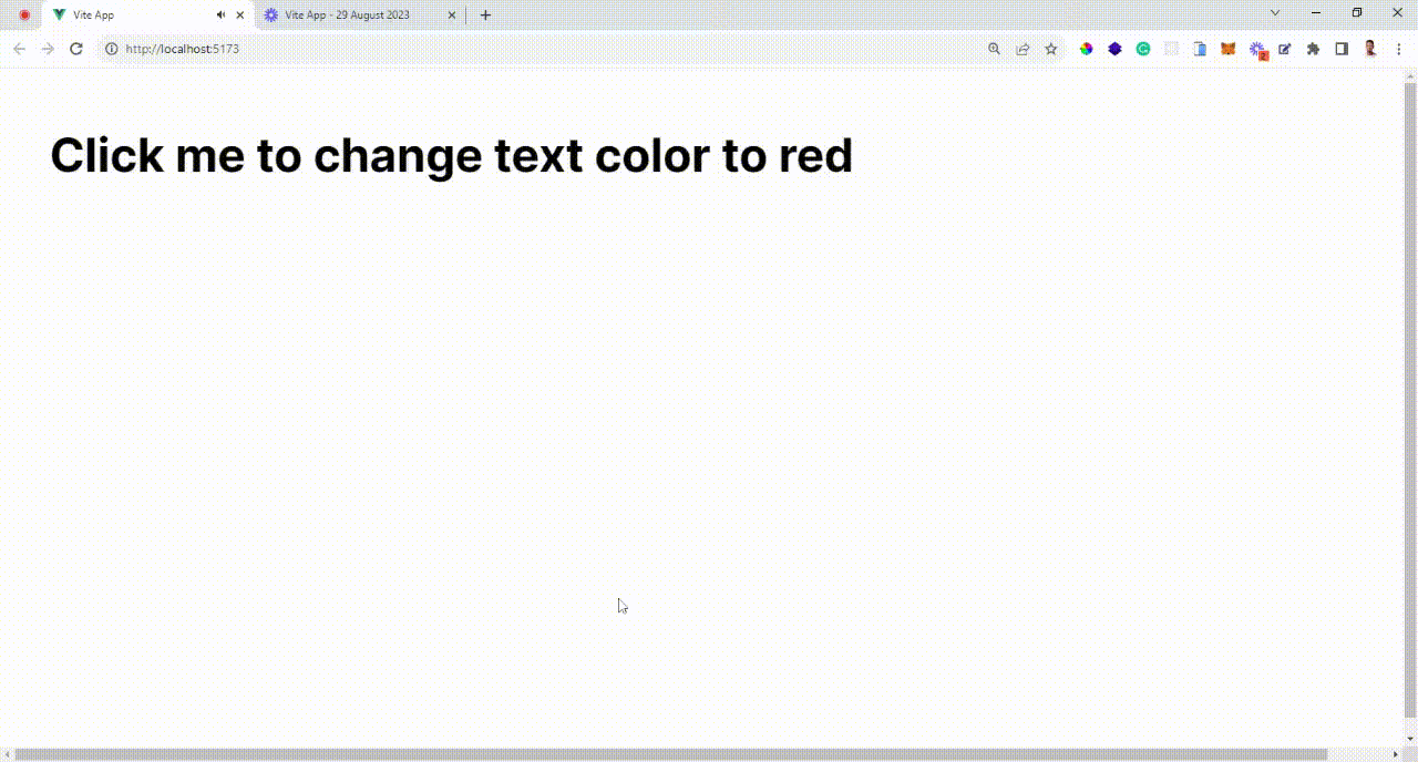
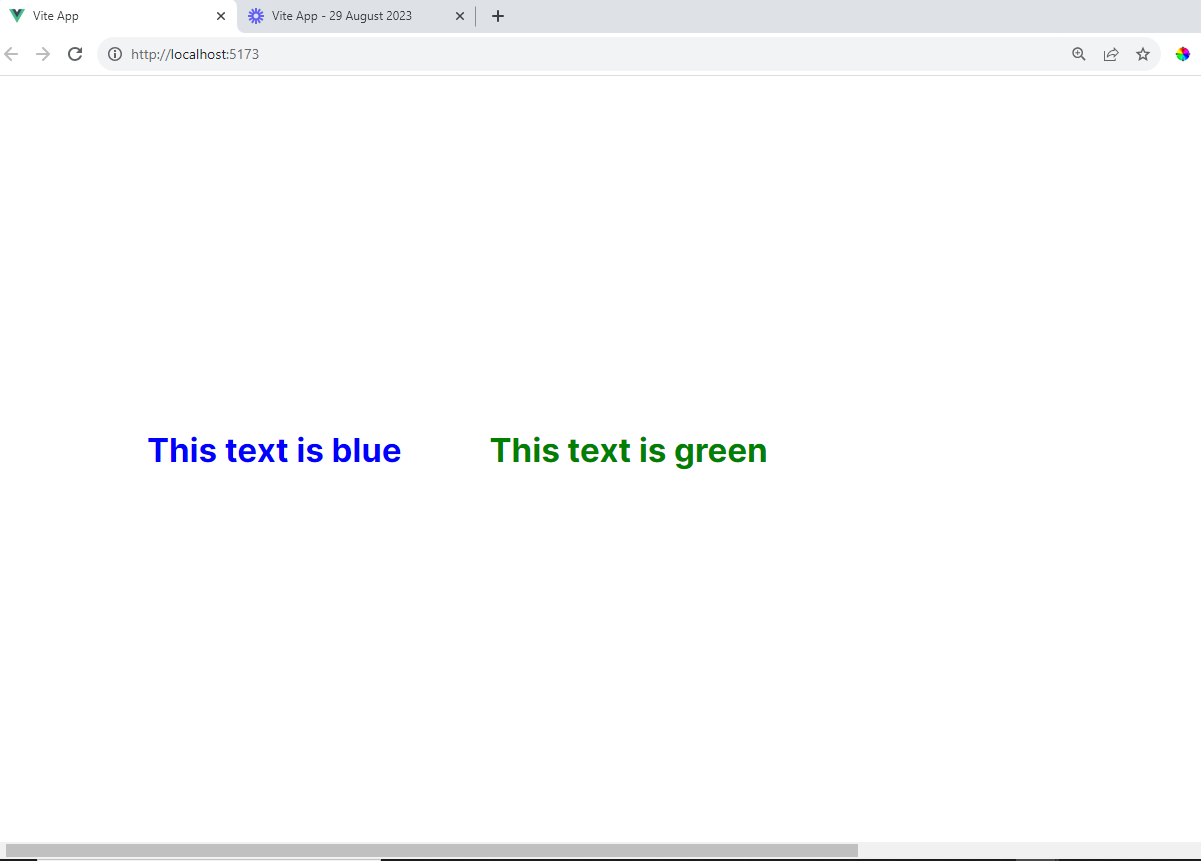
Passing Values with Bind and Update Modifiers Custom directives often require dynamic values to modify their behaviour based on component data. Vue.js provides two modifiers, bind and update, that allows you to pass values to your custom directive and update them whenever the component data changes.
Suppose you want to create a directive called v-color that changes the text color of an element based on the value passed to it. You can use the bind modifier to set the initial color and the update modifier to update the color when the component's data changes.
// Inside main.js file
import { createApp } from 'vue'

const app = createApp({})

app.directive('color', {
  mounted(el, binding) {
    el.style.color = binding.value
  },
  updated(el, binding) {
    el.style.color = binding.value
  }
})
Usage:
You can use the v-color directive in your component's template, passing the desired color as a parameter:
<template>
  <div>
    <p v-color="'blue'">This text is blue</p>
    <p v-color="'green'">This text is green</p>
  </div>
</template>
Benefits:
Allows for dynamic modification of directive behavior.
Maintains the directive's synchronization with changing component data.
Directive Lifecycle
In Vue.js, the Directive Lifecycle refers to the series of events and interactions that take place over the lifecycle of a custom directive. Custom directives are useful tools for augmenting Vue.js apps by adding additional functionality to HTML. Vue.js offers hooks to govern the behavior of these directives when they are inserted, changed, and deleted from the DOM.
The following are the primary directive lifecycle hooks:
1. beforeMount:
Hook Description: Before the directive is placed into the DOM, the
beforeMounthook is invoked. It provides a chance to do setup activities that must be completed before the directive's host component is mounted.Use Case: This hook is useful when you need to prepare resources or do basic configuration before the directive's functionality is activated.
Example Use Case: If you're creating a custom directive that requires access to external APIs or services, you can use the
beforeMounthook to initialize those resources before they are used.
2. mounted:
Hook Description: The
mountedhook is triggered when the directive's host component and all its child components have been compiled and inserted into the DOM. This is a suitable place to interact with the DOM and perform actions that require elements to be present.Use Case: This hook is required for configuring event listeners, performing DOM modifications, and initiating any interaction related with the directive.
Example Use Case: When creating a directive for lazy loading images, you can use the
mountedhook to set up an intersection observer to load images as they come into the viewport.
3. update:
Hook Description:The
updatehook is invoked anytime the binding value of the directive or any other relevant component data changes. It is activated on the initial render as well as future updates.Use Case: This hook allows you to respond to changes in the directive's binding value or related component state. It's helpful in keeping the directive in sync with dynamic data.
Example Use Case: If you're building a directive that adjusts its behaviour based on a data-driven condition, like toggling an element's visibility, you can use the
updatehook to apply changes when the data changes.
4. unmounted:
Hook Description: The
unmountedhook is called when the directive's host component is removed from the DOM. It's a good place to perform cleanup tasks, remove event listeners, and release resources.Use Case: This hook guarantees that any resources or bindings connected with the directive are correctly cleaned away when it is no longer required.
Example Use Case: If your directive is using event listeners to track user interactions, you can use the
unmountedhook to remove those event listeners and prevent memory leaks.
Examples: Search Bar Focus
Register focus directive globally
Custom directives can greatly simplify common user interactions. In this example, we'll create a directive that focuses an input element when the page loads. This is useful for improving user experience, especially when a search bar is prominently featured.
Implementation:
First, let's define and register the "v-focus" directive globally:
import { createApp } from 'vue'

const app = createApp({})

app.directive('focus', {
  mounted(el) {
    el.focus()
  }
})
Usage:
Now you can use the v-focus directive in your component's template:
<template>
  <div>
    <input v-focus />
  </div>
</template>
Benefits:
Improves user experience by automatically focusing input elements.
Reduces the need for manual interaction to activate input fields.
Handle focus/blur to control styles
Additionally, you can enhance the user experience by changing the appearance of the focused input element:
// main.js
import { createApp } from 'vue'

const app = createApp({})
app.directive('focus', {
  mounted(el) {
    el.focus()
    el.classList.add('focused')
  },
  unmounted(el) {
    el.classList.remove('focused')
  }
})
/* In your CSS file or feel free to add your style */
.focused {
  border-color: #007bff;
}
Usage: Now the v-focus directive will not only focus the input but also apply the focused style to it.
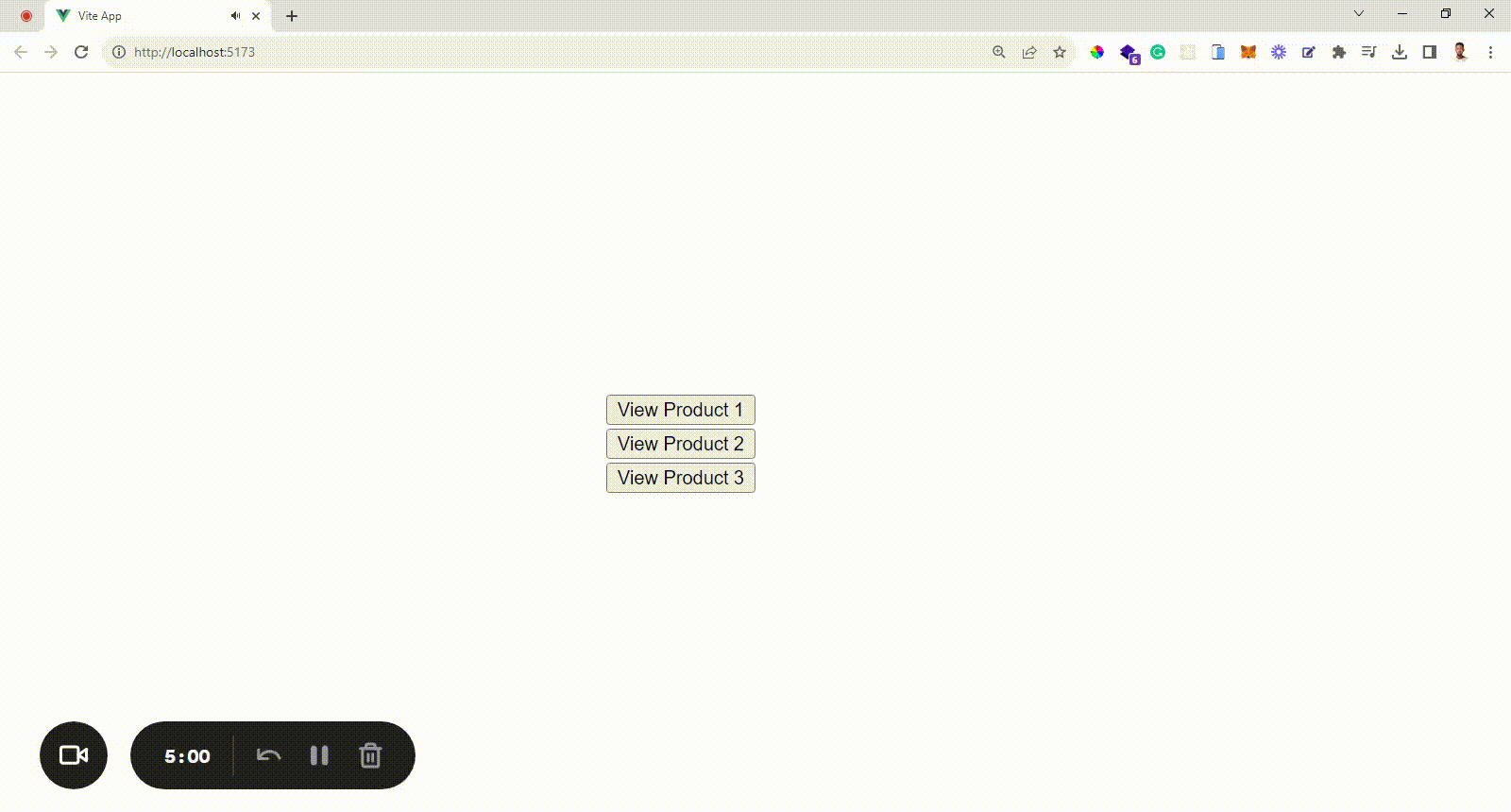
Example: Product Modal - Enhancing User Experience with Custom Directives In modern web applications, user experience is paramount. One way to provide a seamless and interactive experience is through the use of custom directives in Vue.js. In this example, we'll explore how to create a custom directive that enhances the user experience by implementing a product modal functionality. We'll cover the steps to register the modal directive locally, open the modal when a product is clicked, conditionally show the modal component, and manage its display and behavior.
Step 1: Register Modal Directive Locally
To begin, let's create a local custom directive called "v-modal" that will manage the modal's display and behavior within a specific component. This approach encapsulates the directive's logic within the component it's intended for, providing better organization and reusability.
 <script setup>
    import { ref } from 'vue'
    import Modal from './components/Modal.vue'
    const modalOpen = ref(false)
    const currentProduct = ref({})
    const products = [
            { id: 1, name: 'Product A', price: 20.99 },
            { id: 2, name: 'Product B', price: 32.50 },
            { id: 3, name: 'Product C', price: 15.75 }
          ]
    function openModal(product) {
      currentProduct.value = product
      modalOpen.value = true
    }
    function closeModal() {
      modalOpen.value = false
    }
    </script>
    <template>
        <div>
            <div v-for="product in products" :key="product.id">
              <button @click="openModal(product)">
                View Product {{ product.id }}
              </button>
            </div>
              <Modal v-if="modalOpen" @close="closeModal">
              <h2>Product Details</h2>
              <p>Name: {{ currentProduct.name }}</p>
              <p>Price: ${{ currentProduct.price }}</p>
          <button @click="addToCart(currentProduct)">Add to Cart</button>
        </Modal>
    </div>
    </template>

<script>
    import Modal from './components/Modal.vue';
    export default {
        components: {
        Modal,
        },
        data() {
        return {
          modalOpen: false,
          currentProduct: {},
          products: [
            { id: 1, name: 'Product A', price: 20.99 },
            { id: 2, name: 'Product B', price: 32.50 },
            { id: 3, name: 'Product C', price: 15.75 },
          ],
        };
        },
        methods: {
            openModal(product) {
              this.currentProduct = product;
              this.modalOpen = true;
            },
            closeModal() {
              this.modalOpen = false;
            },
        },
    };
</script>
Step 2. Open Modal When Product Clicked
In the example above, when the "View Details" button is clicked, the openModal method is called. This sets the showModal ref to true.
Step 3. Conditionally Show Modal Component
The v-if directive in the template ensures that the modal component is only rendered when showModal is true. This prevents unnecessary rendering when the modal is not in use, optimizing performance.
Step 4. Manage Modal Display and Behavior
Inside the Modal component, you can manage the display and behavior of the modal. This can include setting the modal's position, styling, animations, and including relevant content.
<template>
  <div class="modal-wrapper">
    <div class="modal-content">
      <slot></slot> <!-- Content passed from parent component -->
      <button @click="closeModal">Close</button>
    </div>
  </div>
</template>
<script>
export default {
  methods: {
    closeModal() {
      this.$emit('close');
    },
  },
};
</script>
<style scoped>
.modal-wrapper {
  position: fixed;
  top: 0;
  left: 0;
  width: 100%;
  height: 100%;
  background-color: rgba(0, 0, 0, 0.5);
  display: flex;
  justify-content: center;
  align-items: center;
}
.modal-content {
  background-color: white;
  padding: 20px;
  border-radius: 4px;
  box-shadow: 0 2px 4px rgba(0, 0, 0, 0.1);
}
button {
  background-color: #007bff;
  color: white;
  border: none;
  padding: 10px 20px;
  border-radius: 4px;
  cursor: pointer;
}
</style>
To make the modal visually appealing, you can add some CSS styles.
In this simplified example, clicking the "Close" button emits a "close" event, which triggers the closeModal method in the parent component, setting showModal back to false and hiding the modal.
By crafting a custom directive to manage a product modal's display and behavior, we've showcased the power of Vue.js directives in creating rich and interactive user experiences. This approach allows us to encapsulate logic within the component, enhancing organization and reusability while ensuring a polished and seamless interaction for users. Custom directives are a testament to Vue.js's flexibility and ability to extend HTML with tailored functionalities that align with modern web application requirements.
Conclusion
In closing, our exploration of Vue.js custom directives has revealed their ability to enhance web applications profoundly. These directives encapsulate intricate logic within succinct attributes, fostering organized and reusable code. Their power is remarkable, yet wise application is crucial for maintaining code simplicity. As we conclude, remember that this journey is but a stepping stone into more advanced territory. Continuous learning and experimentation are your allies as you harness Vue.js custom directives to craft immersive and dynamic user experiences.